Tracing the Path of SidecarT’s Revisions
This week marks a significant milestone for the SidecarTridge Multi-device community as I’ve rolled out the latest revision of the SidecarTridge Multi-device board to the first customers. It’s been an incredible journey since I introduced the initial version in the summer of 2023. In just six months, I’ve seen over 400 boards make their way into the hands of enthusiastic users around the world. Their invaluable feedback has been the driving force behind the design of this new revision, which incorporates several enhancements aimed at addressing the challenges and requests of the users.
Before diving into the specifics of these new features, it’s important to look back at the evolution of the SidecarTridge Multi-device board. Believe it or not, there have been three distinct revisions to date. Each one represents a step forward in the ongoing quest to refine and improve the SidecarTridge Multi-device experience. Let’s take a moment to recap the journey and the unique characteristics of each revision.
Revision 0: The Original
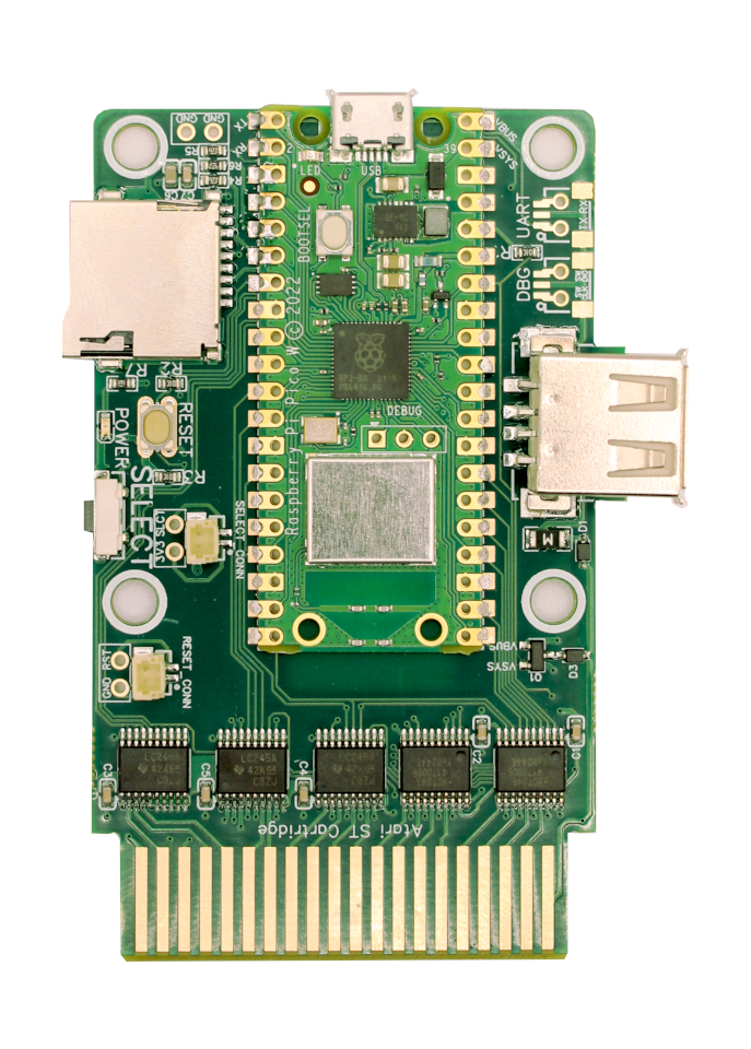
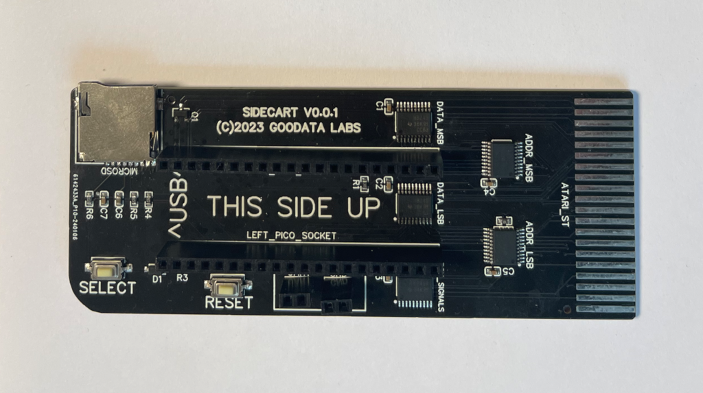
For those of you who acquired a SidecarTridge Multi-device board prior to February 2024, you’re likely in possession of Revision 0 - the original iteration of the board. This initial design was the result of careful consideration and a few tweaks to the early prototype before it reached the customers. My approach was guided by several key constraints:
- Project Scope: I envisioned SidecarTridge Multi-device as a small-scale project, anticipating a demand for no more than 25 to 30 boards. I was wrong…
- Cost Management: Keeping the project’s costs down was a priority, especially considering the implications of shipping and taxes on a batch of 25 boards.
- PCB Design: Opting for a two-layer PCB was a cost-driven decision. The limited scope of the project didn’t justify the expense of a four-layer PCB.
- Track Width and Clearance: I aimed for sufficient width and clearance in the PCB tracks to prevent issues in noisy electronic environments.
- Board Size: The “generous” dimensions of the board were dictated by several physical factors, including the cartridge connector hole in the computer, the dimensions of the Pico W board, the height of the headers, and the design choices related to PCB layers and track parameters.
Despite these constraints, I’ve been fortunate to see hundreds of these boards thrive in the hands of users globally, without any significant electrical or electronic issues leading to failure. However, user feedback has highlighted a few design aspects that require attention:
- Case Compatibility: The absence of holes for cases in Revision 0 was a consequence of the PCB layer and track width constraints.
- SELECT Button Design: Users reported that pressing the SELECT button caused the board to feel unstable, as if it might bend or disconnect. This was a design oversight that needed addressing.
- Power Status Indication: There was a lack of clear indication regarding the board’s power status – whether it was on or off.
- Connector Height: The height of the Pico W headers resulted in a bulky profile, resembling a “camel hump.” Exploring alternatives to these connectors could lead to a slimmer, lighter board.
These insights from the community have been invaluable in guiding the next steps of the SidecarT’s development journey.
Revision 1: The Hidden Failure
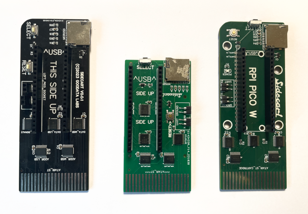
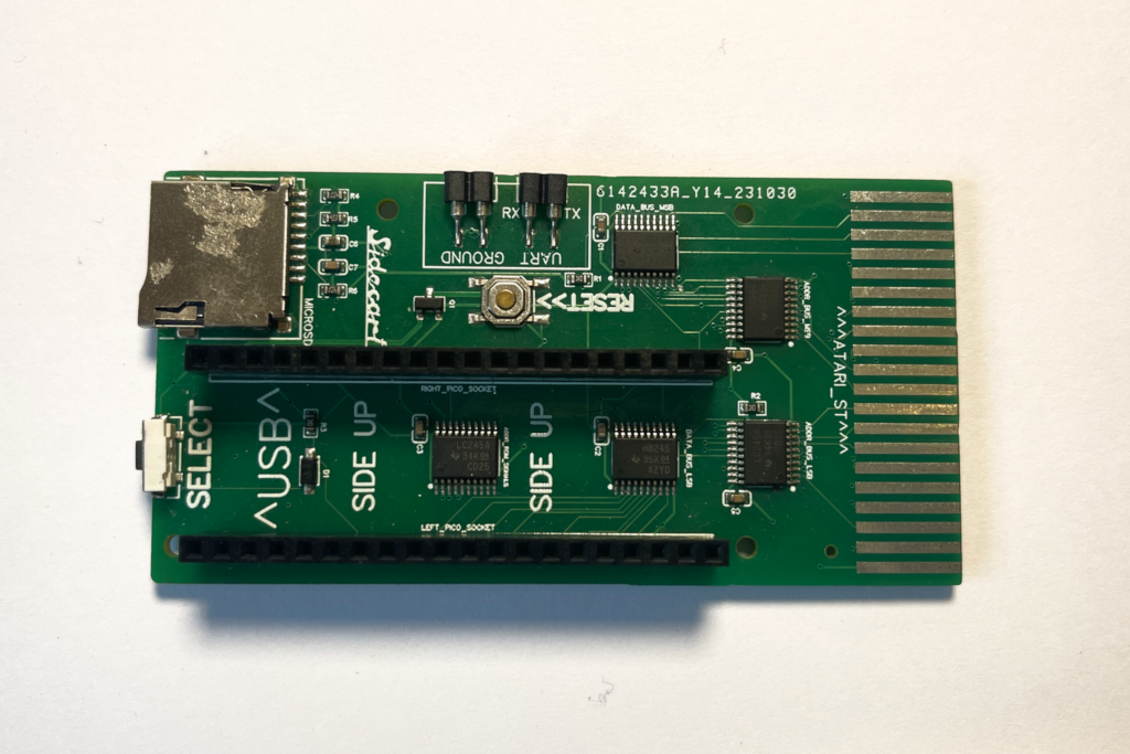
Embarking on the task of addressing the design issues identified in Revision 0, I ventured into the development of Revision 1. This iteration was an exercise in learning about the intricacies of physical design prototyping, as evidenced by the accompanying picture showing a more compact board – about 70% of the size of its predecessor. The repositioning of several components was a key aspect of this redesign. Here are the details:
-
Four-Layer PCB: Recognizing the increased production scale, it became feasible to shift from a two-layer to a four-layer PCB. This change not only justified the cost but also allowed for full internal copper planes dedicated to power and ground, potentially stabilizing signals in systems with addressing bus issues. However, I realized that this might not significantly enhance electromagnetic isolation.
-
Reduced PCB Size: The smaller footprint of the board reduced its propensity to bend, addressing one of the concerns raised by users of Revision 0.
-
Relocated Pico W Headers: Moving the Pico W headers closer to the cartridge connector seemed promising initially. However, it led to a critical issue: incompatibility with Mega ST and STEs, due to variations in the Atari ST’s cartridge connector hole.
-
Case Mounting Holes: The introduction of four new two-millimeter holes for cases turned out to be problematic. The holes were too small, and the resulting thin plastic pillars were prone to breaking.
-
Redesigned SELECT Button: Relocating the SELECT button to the side of the board proved to be a successful modification. It eliminated the issue of board bending when the button was pressed, as the computer’s weight now counteracted the pressing force.
-
RESET Button and Debugging Connectors: These components were also repositioned. The RESET button remained on the top of the board, where bending was less of a concern due to its infrequent use.
-
Rotated microSD Connector: The microSD card slot was rotated by 270 degrees, allowing the card to be inserted from the front.
Despite these changes, it became evident that the physical redesign of Revision 1 had its shortcomings. A crucial realization from some users was that this new design rendered the cases built for Revision 0 obsolete, leading to frustration over the lack of backward physical compatibility. This feedback highlighted the need for a design approach that could retain successful changes while abandoning those that proved ineffective.
Revision 2: The hybrid
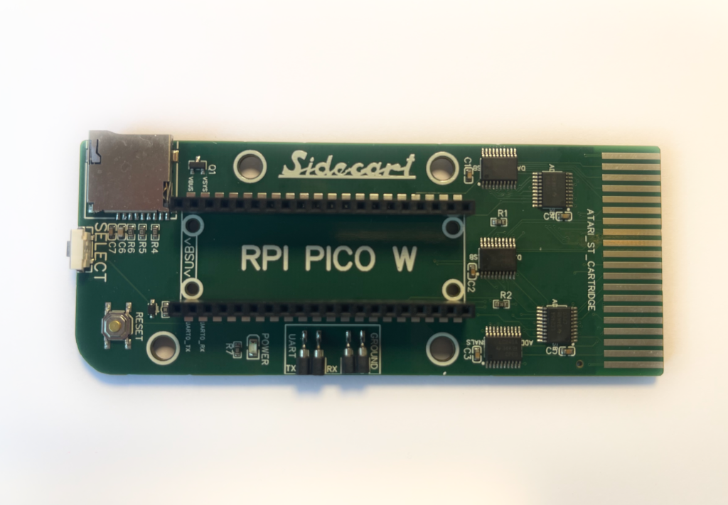
With the lessons learned from the previous revisions, Revision 2 was born, representing a synthesis of the best features from its predecessors, coupled with some additional improvements. This latest iteration can be seen as a hybrid, carefully balancing the successful elements of both prior versions:
-
Four-Layer PCB: Continuing with the four-layer design introduced in Revision 1.
-
Board Size and Layout: To ensure maximum compatibility with existing cases, Revision 2’s size and layout are modeled after Revision 0. This decision was made to respect the investments of the early adopters and maintain consistency in the user experience.
-
Enhanced Case Mounting: Addressing the fragility issue of previous designs, I’ve introduced four larger, four-millimeter holes to support more robust case pillars.
-
Optimized Button Placement: In a thoughtful redesign, the SELECT button has been relocated to the front of the board. Meanwhile, the RESET button now occupies the former position of the SELECT button. This arrangement allows users with existing cases to easily adapt by relabeling the SELECT to RESET and creating a small new opening for the SELECT button on the front of the case.
-
Power LED Indicator: Where the RESET button was located in Revision 0, a new green POWER LED has been added. This serves as a clear and convenient power status indicator, and for those with existing cases, the RESET hole can now function as a viewing window for this LED.
-
Castellated Pico W Option: In an effort to reduce the board’s profile, I’ve introduced new pads for soldering a castellated Pico W directly, eliminating the need for bulky headers.
This latest revision has been meticulously designed with backward compatibility in mind, particularly considering those makers who have already invested in creating cases for their boards. While striving for compatibility, it’s understood that minor adjustments may still be necessary, but the core design remains largely consistent with Revision 0. This approach reflects the commitment to the community, ensuring that the advancements we make are both respectful of and beneficial to the user base.
And What About the Future of SidecarTridge Multi-device?
As we look to the horizon, the question of what comes next for SidecarTridge Multi-device naturally arises. While the specifics of the next version remain a mystery - both in terms of timing and features - one thing is certain: we must preserve the core identity of SidecarTridge Multi-device. This includes:
- Simplicity: Avoiding unnecessary complexity.
- Affordability: Keeping costs low.
- Compatibility: Ensuring it works well with existing versions.
- Solderless Design: Maintaining ease of assembly and modification.
Thanks to the vibrant discussions and feedback from the community, several exciting ideas are currently being considered for future iterations:
-
USB A Connectors for Power: Adding one or two USB A connectors to power hard disks seems like an accessible enhancement. The main consideration here is balancing the feature with cost implications.
-
Cartridge Connector Pass-Through: Surprisingly, this has emerged as a highly requested feature. However, implementing it poses challenges, primarily due to the scarcity of suitable female connectors like those in the classic Atari ST. I’m exploring alternatives, possibly involving larger connectors with special holders. A feasible compromise might be to include a placeholder for the pass-through connector’s footprint.
-
Dual LED Power Indicator: Given that SidecarTridge Multi-device can be powered either via USB or the Atari ST connector, a dual-color LED indicator could provide a clear visual cue for the power source being used.
-
Improved ROM Emulation Synchronization: By recreating the Chip Select/Enabled signals from the ROM3 and ROM4 signals, we could enhance the synchronization of ROM emulation, especially at speeds exceeding 8MHz. This modification might increase the cost slightly but could significantly improve reliability.
-
Alternative RP2040 Board Use: Currently, SidecarTridge Multi-device utilizes the Raspberry Pi Pico W/WH, which includes the RP2040 microcontroller and CYW43439 for WiFi and Bluetooth. Directly integrating these components into the board could drastically reduce its size. However, the cost of the CYW43439 in small batches is a major hurdle, as it makes competing with the affordably priced Pico W challenging. Same happens trying to use a board from another manufacturer.
-
SELECT Button with Springs: Inspired by the tactile feel of the RESET button on the Atari ST, adding a similar quality SELECT button would be ideal. Though more expensive and requiring manual soldering, we might include a placeholder for enthusiasts who wish to add this feature themselves.
These ideas represent just a glimpse of the potential directions for SidecarTridge Multi-device. Your input is invaluable in shaping its future. If you have suggestions or ideas, please get in touch through our usual channels and share your thoughts. Together, we can continue to evolve SidecarTridge Multi-device while staying true to the principles of simplicity, affordability, solderless design, and backward compatibility.


